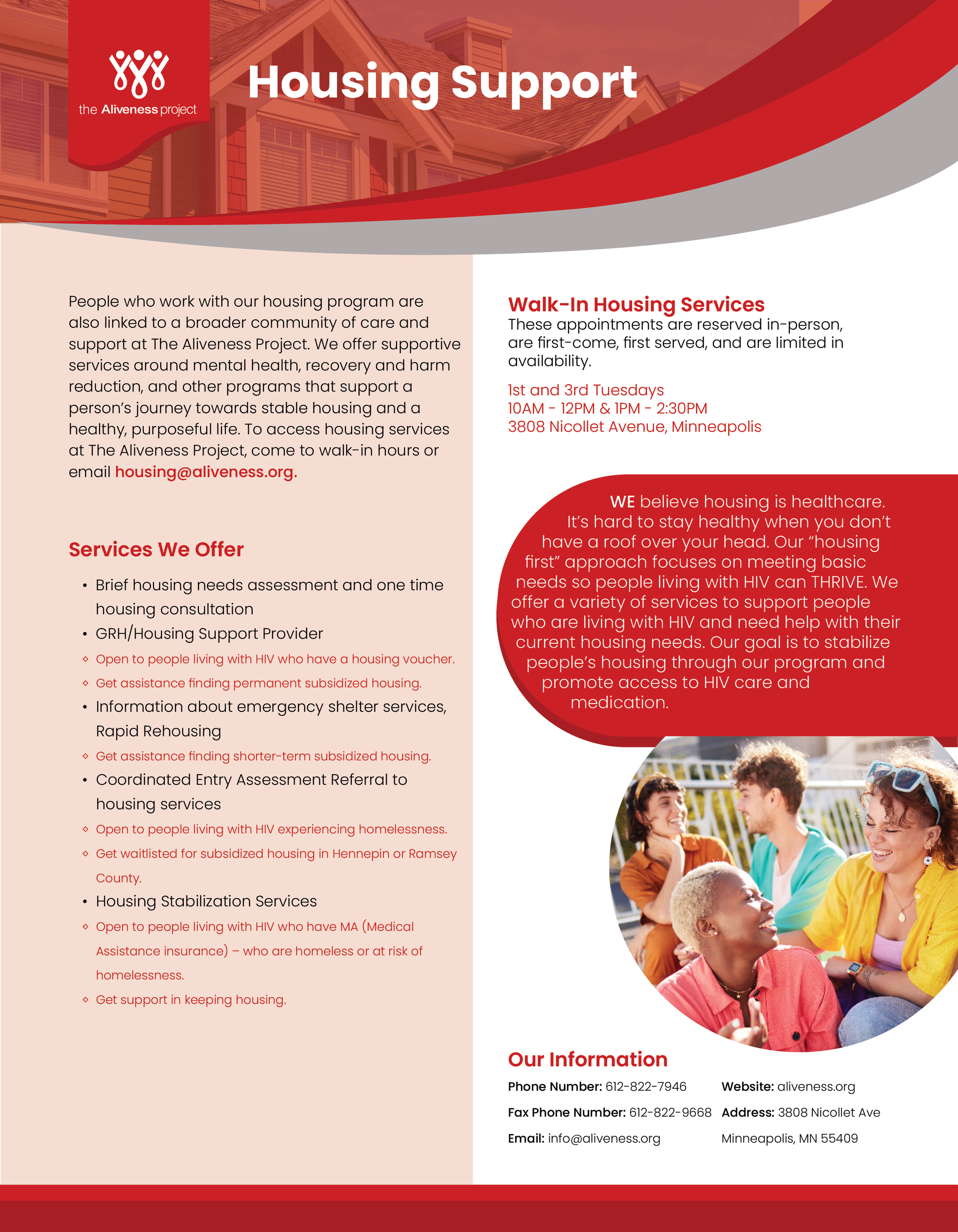
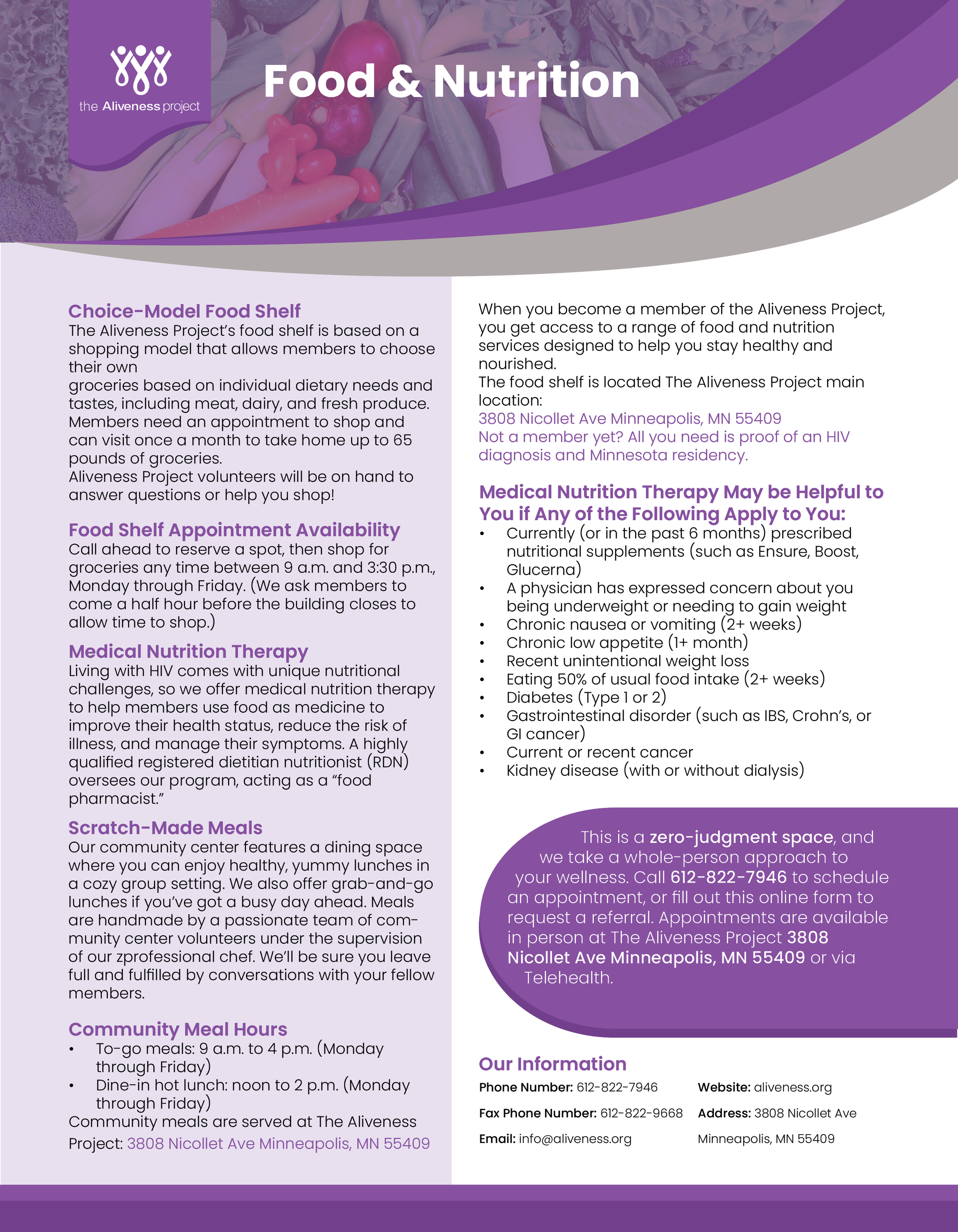
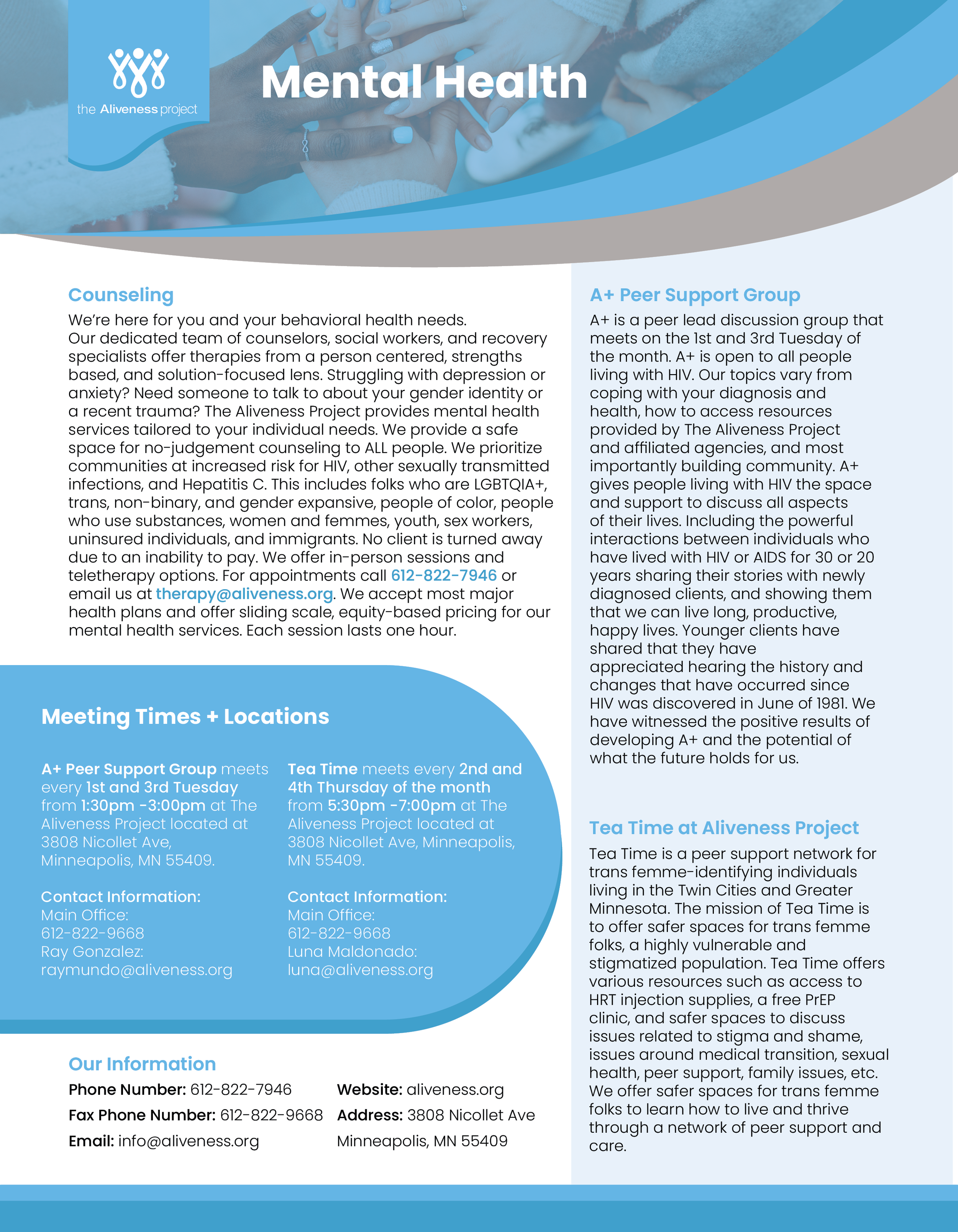
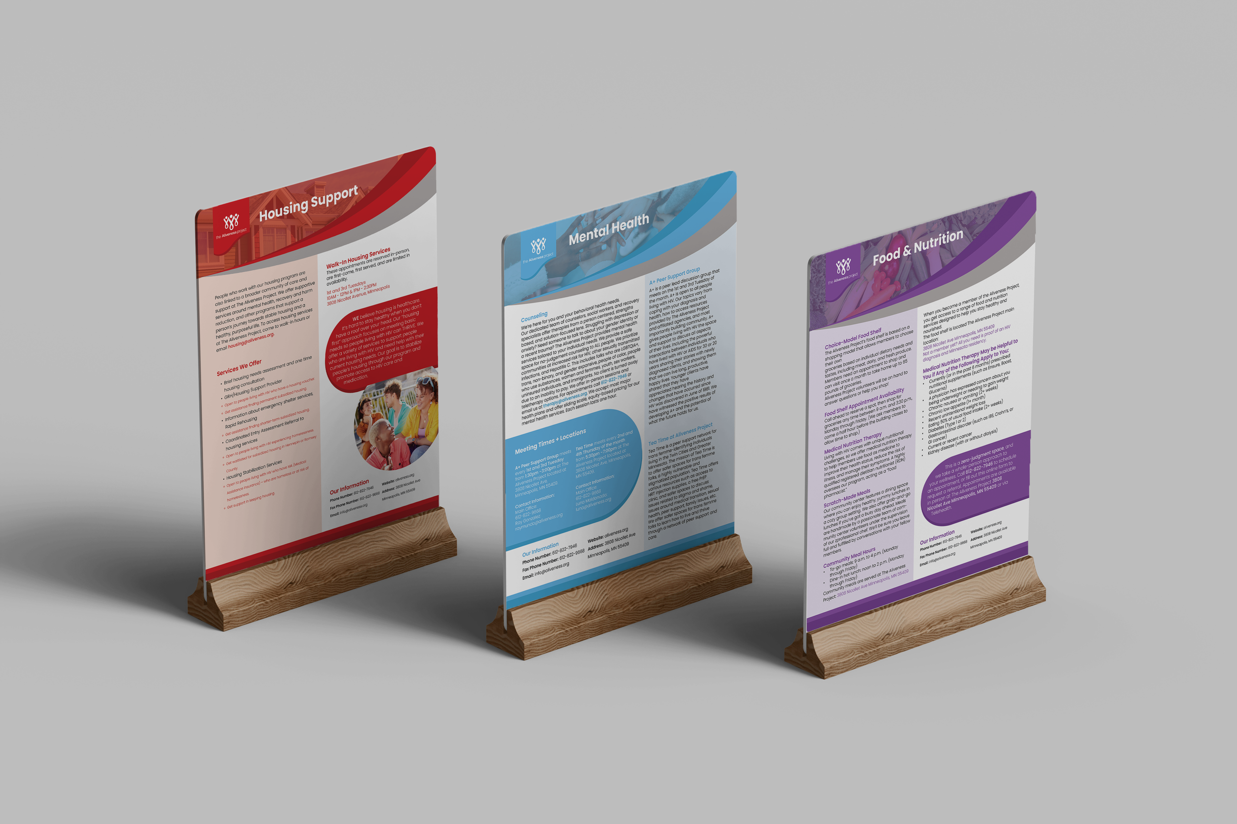
Informational flyers
This project involved designing a cohesive series of flyers for The Aliveness Project, a Minneapolis-based nonprofit community center that provides free, comprehensive services for individuals living with or at high risk of HIV, with a focus on advancing health equity through community connection. The goal was to create a unified visual system while allowing each flyer to maintain its own distinct identity. The main design work was created in InDesign, with supporting visual elements developed in Illustrator and Photoshop. I used the organization’s brand colors—red, purple, and blue—to individually theme each flyer, ensuring variation within a consistent framework. Cohesion was achieved through repeated design elements, including a signature curved “swoop” of color across the top, rounded information bubbles that create an approachable and organized feel, and a consistent two-column layout to support readability. Additionally, headlines were color-coded to match each flyer’s theme, reinforcing both individuality and unity. The final series successfully balances consistency and variation, presenting clear, engaging designs that align with The Aliveness Project’s mission and visual identity.